
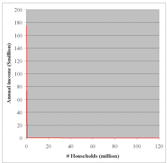
 Clay Shirky’s much-cited Power Law for Blogs is the latest incarnation of the age-old ’80-20′ rule (the top 20% have 80% and the remaining 80% have 20% — of hits, links, popularity, ‘wealth of audience’ etc. Recently, Alternet has cited some US income statistics from 2000 (latest available year), statistics that put the blogosphere’s inverse curves to shame. I’ve plotted this data in red on the chart above. Read it and weep. Clay Shirky’s much-cited Power Law for Blogs is the latest incarnation of the age-old ’80-20′ rule (the top 20% have 80% and the remaining 80% have 20% — of hits, links, popularity, ‘wealth of audience’ etc. Recently, Alternet has cited some US income statistics from 2000 (latest available year), statistics that put the blogosphere’s inverse curves to shame. I’ve plotted this data in red on the chart above. Read it and weep.
Here’s the data that is plotted: The top 400 households in the US had a median income of $175 million per year. They’re the ones that will primarily benefit from the Bush tax cuts. The top million households had a median income $1.1 million and all earned over $314 thousand. The top five million households had income in excess of $150 thousand. The median income for all households was $43 thousand, a little over twice the poverty level that about one fourth of households fell below. Put another way, the richest 2% of American households have over 50% of the country’s disposable income. It looks like two straight lines, but it’s actually an astronomically steep curve that shows just how inequitably income, and power, are distributed in the US. And Alternet reports that the curve for wealth (accumulated income) is much steeper even than the income curve shown above. Five million US households possess over 60% of the nation’s total wealth. Power in our society is shifting quickly and inexorably from the one-man-one-vote ballot booth (where we all have, at least in theory, equal influence and power) to the one-share-one-vote boardroom (where the distribution of power is roughly as diagrammed above). Kinda sobering, isn’t it? |
Navigation
Collapsniks
Albert Bates (US)
Andrew Nikiforuk (CA)
Brutus (US)
Carolyn Baker (US)*
Catherine Ingram (US)
Chris Hedges (US)
Dahr Jamail (US)
Dean Spillane-Walker (US)*
Derrick Jensen (US)
Dougald & Paul (IE/SE)*
Erik Michaels (US)
Gail Tverberg (US)
Guy McPherson (US)
Honest Sorcerer
Janaia & Robin (US)*
Jem Bendell (UK)
Mari Werner
Michael Dowd (US)*
Nate Hagens (US)
Paul Heft (US)*
Post Carbon Inst. (US)
Resilience (US)
Richard Heinberg (US)
Robert Jensen (US)
Roy Scranton (US)
Sam Mitchell (US)
Tim Morgan (UK)
Tim Watkins (UK)
Umair Haque (UK)
William Rees (CA)
XrayMike (AU)
Radical Non-Duality
Tony Parsons
Jim Newman
Tim Cliss
Andreas Müller
Kenneth Madden
Emerson Lim
Nancy Neithercut
Rosemarijn Roes
Frank McCaughey
Clare Cherikoff
Ere Parek, Izzy Cloke, Zabi AmaniEssential Reading
Archive by Category
My Bio, Contact Info, Signature Posts
About the Author (2023)
My Circles
E-mail me
--- My Best 200 Posts, 2003-22 by category, from newest to oldest ---
Collapse Watch:
Hope — On the Balance of Probabilities
The Caste War for the Dregs
Recuperation, Accommodation, Resilience
How Do We Teach the Critical Skills
Collapse Not Apocalypse
Effective Activism
'Making Sense of the World' Reading List
Notes From the Rising Dark
What is Exponential Decay
Collapse: Slowly Then Suddenly
Slouching Towards Bethlehem
Making Sense of Who We Are
What Would Net-Zero Emissions Look Like?
Post Collapse with Michael Dowd (video)
Why Economic Collapse Will Precede Climate Collapse
Being Adaptable: A Reminder List
A Culture of Fear
What Will It Take?
A Future Without Us
Dean Walker Interview (video)
The Mushroom at the End of the World
What Would It Take To Live Sustainably?
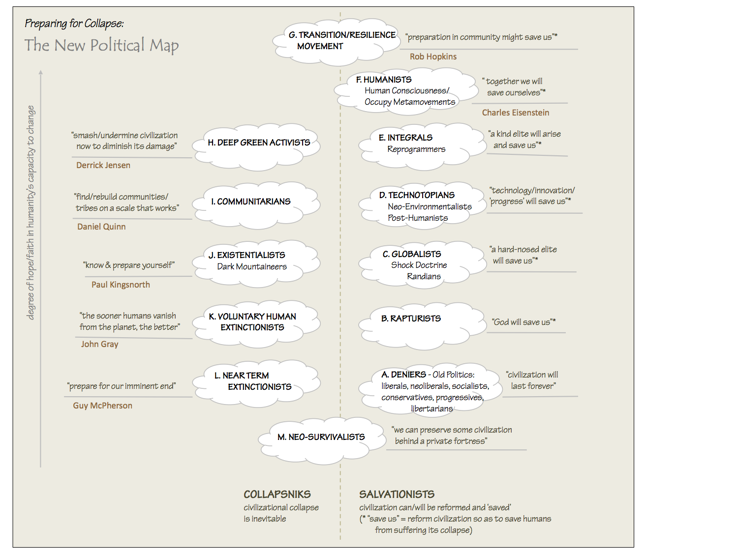
The New Political Map (Poster)
Beyond Belief
Complexity and Collapse
Requiem for a Species
Civilization Disease
What a Desolated Earth Looks Like
If We Had a Better Story...
Giving Up on Environmentalism
The Hard Part is Finding People Who Care
Going Vegan
The Dark & Gathering Sameness of the World
The End of Philosophy
A Short History of Progress
The Boiling Frog
Our Culture / Ourselves:
A CoVid-19 Recap
What It Means to be Human
A Culture Built on Wrong Models
Understanding Conservatives
Our Unique Capacity for Hatred
Not Meant to Govern Each Other
The Humanist Trap
Credulous
Amazing What People Get Used To
My Reluctant Misanthropy
The Dawn of Everything
Species Shame
Why Misinformation Doesn't Work
The Lab-Leak Hypothesis
The Right to Die
CoVid-19: Go for Zero
Pollard's Laws
On Caste
The Process of Self-Organization
The Tragic Spread of Misinformation
A Better Way to Work
The Needs of the Moment
Ask Yourself This
What to Believe Now?
Rogue Primate
Conversation & Silence
The Language of Our Eyes
True Story
May I Ask a Question?
Cultural Acedia: When We Can No Longer Care
Useless Advice
Several Short Sentences About Learning
Why I Don't Want to Hear Your Story
A Harvest of Myths
The Qualities of a Great Story
The Trouble With Stories
A Model of Identity & Community
Not Ready to Do What's Needed
A Culture of Dependence
So What's Next
Ten Things to Do When You're Feeling Hopeless
No Use to the World Broken
Living in Another World
Does Language Restrict What We Can Think?
The Value of Conversation Manifesto Nobody Knows Anything
If I Only Had 37 Days
The Only Life We Know
A Long Way Down
No Noble Savages
Figments of Reality
Too Far Ahead
Learning From Nature
The Rogue Animal
How the World Really Works:
Making Sense of Scents
An Age of Wonder
The Truth About Ukraine
Navigating Complexity
The Supply Chain Problem
The Promise of Dialogue
Too Dumb to Take Care of Ourselves
Extinction Capitalism
Homeless
Republicans Slide Into Fascism
All the Things I Was Wrong About
Several Short Sentences About Sharks
How Change Happens
What's the Best Possible Outcome?
The Perpetual Growth Machine
We Make Zero
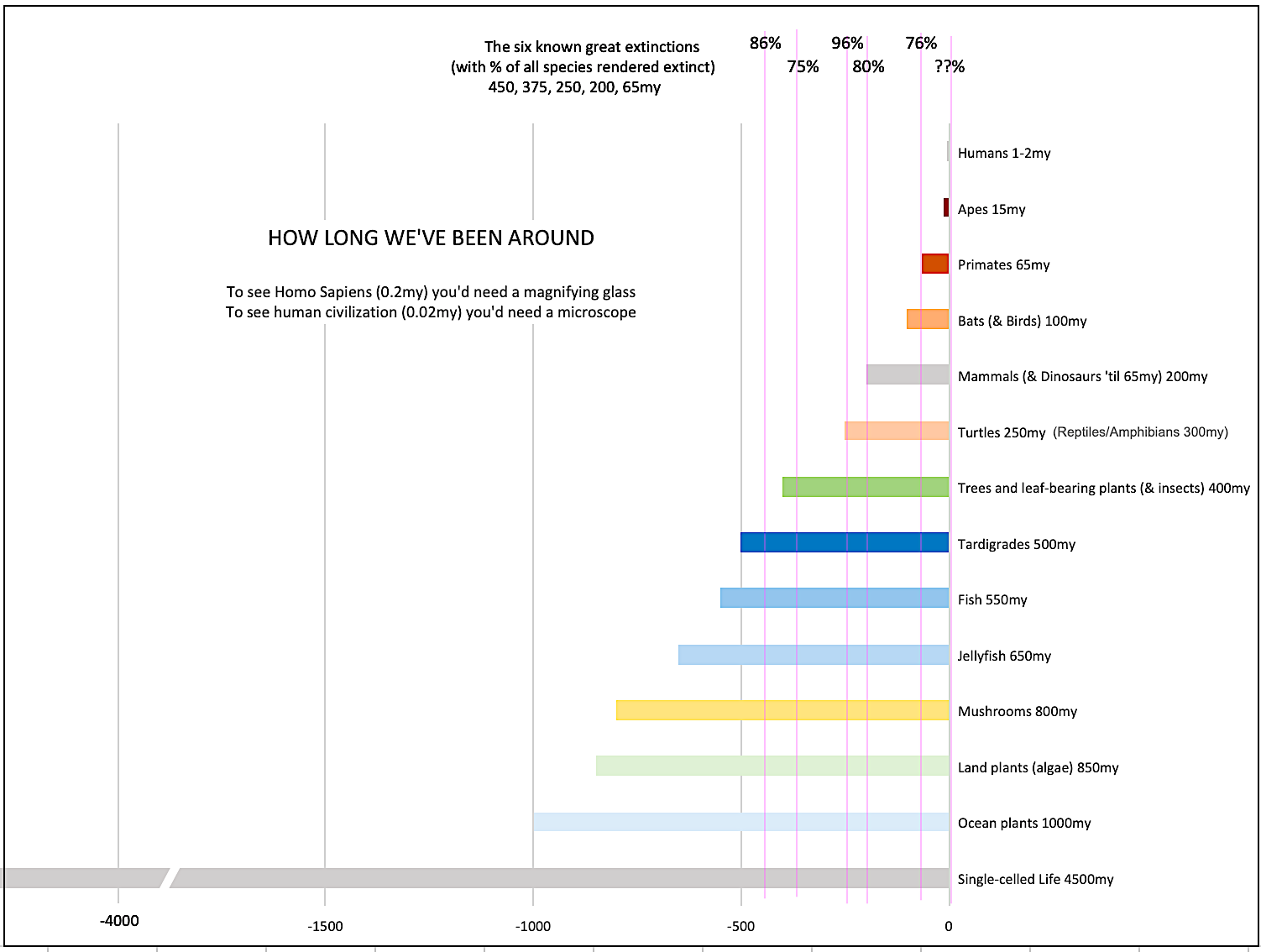
How Long We've Been Around (graphic)
If You Wanted to Sabotage the Elections
Collective Intelligence & Complexity
Ten Things I Wish I'd Learned Earlier
The Problem With Systems
Against Hope (Video)
The Admission of Necessary Ignorance
Several Short Sentences About Jellyfish
Loren Eiseley, in Verse
A Synopsis of 'Finding the Sweet Spot'
Learning from Indigenous Cultures
The Gift Economy
The Job of the Media
The Wal-Mart Dilemma
The Illusion of the Separate Self, and Free Will:
No Free Will, No Freedom
The Other Side of 'No Me'
This Body Takes Me For a Walk
The Only One Who Really Knew Me
No Free Will — Fightin' Words
The Paradox of the Self
A Radical Non-Duality FAQ
What We Think We Know
Bark Bark Bark Bark Bark Bark Bark
Healing From Ourselves
The Entanglement Hypothesis
Nothing Needs to Happen
Nothing to Say About This
What I Wanted to Believe
A Continuous Reassemblage of Meaning
No Choice But to Misbehave
What's Apparently Happening
A Different Kind of Animal
Happy Now?
This Creature
Did Early Humans Have Selves?
Nothing On Offer Here
Even Simpler and More Hopeless Than That
Glimpses
How Our Bodies Sense the World
Fragments
What Happens in Vagus
We Have No Choice
Never Comfortable in the Skin of Self
Letting Go of the Story of Me
All There Is, Is This
A Theory of No Mind
Creative Works:
Mindful Wanderings (Reflections) (Archive)
A Prayer to No One
Frogs' Hollow (Short Story)
We Do What We Do (Poem)
Negative Assertions (Poem)
Reminder (Short Story)
A Canadian Sorry (Satire)
Under No Illusions (Short Story)
The Ever-Stranger (Poem)
The Fortune Teller (Short Story)
Non-Duality Dude (Play)
Your Self: An Owner's Manual (Satire)
All the Things I Thought I Knew (Short Story)
On the Shoulders of Giants (Short Story)
Improv (Poem)
Calling the Cage Freedom (Short Story)
Rune (Poem)
Only This (Poem)
The Other Extinction (Short Story)
Invisible (Poem)
Disruption (Short Story)
A Thought-Less Experiment (Poem)
Speaking Grosbeak (Short Story)
The Only Way There (Short Story)
The Wild Man (Short Story)
Flywheel (Short Story)
The Opposite of Presence (Satire)
How to Make Love Last (Poem)
The Horses' Bodies (Poem)
Enough (Lament)
Distracted (Short Story)
Worse, Still (Poem)
Conjurer (Satire)
A Conversation (Short Story)
Farewell to Albion (Poem)
My Other Sites


While the distribution of income may grow greater (primarily because consolidation has also consolidated personal fortunes of those still in the business) there are some interesting statstics that proove that perhaps things aren’t as bad as they look.The Millionaire Next Door demonstrates that the vast majority of those with significant accumulated wealth are those who have curtailed consumption rather than increased income. The average American, with some self control and a financial plan, can accumulate great wealth. Of course most don’t, but that has to do with a culture of consumption, which is a different issue altogether.Also, of those in the top fifth of income now, one-fifth were in the bottom fifth of income fifteen years ago. (Which is to say that social mobility and entrepreneurship remain a vibrant factor in the economy.)That said, the numbers are scary. It might be interesting to see similar statistics regarding business revenue, where there is also a widening gap between big and small.
Adam; anything about downward mobility?
Adam, I’d like to believe you — both that the average family trying to live on $43k/year before any taxes and expenses can really hope to save much no matter how much discipline they exercise (this seems to me the great American dream turning out to be just that — a dream), and that there is significant mobility between quintiles — I’ve seen data to the contrary (once students in university living temporarily off Daddy’s spare change until Daddy gets them a cushy job after graduation are excluded).
While I agree that upper-middle income Americans could probably be much better off if they’d stop spending so frivolously (a woman at work complains about her taxes but she drives a $60,000 BMW), I don’t think that the bottom quintile of mature wage earners has any real hope of doing that. I’d like to see a study that compares workers in tightly defined age groups–30 to 35 for example–and then sees how the workers in that group move up or down in comparison to each other as they age.
The Washington Post has an excerpt from the first chapter of The Millionaire Next Door: http://www.washingtonpost.com/wp-srv/style/longterm/books/chap1/millionairenextdoor.htm . From one chapter, I’d hate to make judgements about the entire work, but it seems to be on rather flaky grounds (e.g., “For most people in America with annual realized incomes of $50,000…”; the idea that one should have accumulated 10% of one’s current annual salary times age, inter alia. So, if you’re lucky enough to be in the upper income class, you should have saved 10% of your present income every year you’ve been alive.)Barbara Ehrenreich’s book, Nickel and Dimed: On (Not) Getting By in America, I think, offers a better look at the ability of the lower/ working class to move upqards (and, more importantly, to survive in American society).
Brilliant chart, Dave. The distribution is so skewed, with the majority along the x-axis and the minority along the y-axis that at first I didn’t even see it and thought that there was an error in your graphics! This tells a shocking story that everybody in the U.S. lives but hardly anybody seems to know.
It is possible to live WAY below your means. My Dad was a master of that and taught me well. He made me a saver back from when I just started working and I managed to save enough that I am retired early and supporting 5 people on my retirement that I had calculated would only comfortably support one. We are eking out an existance with broadband access to the internet and cable tv as our only real luxury. We are crammed into a small house (two bedrooms and a partially finished basement – 1 bathroom). Lets just say that we have learned to live with closeness and still fight to preserve privacy. While to many it might seem impoverished (and it does to me much of the time as well) it does point out just how little one really needs to get along.I guess this is why I see the graph as being so obscene.
Sean: Agree — Nickel & Dimed is a good study.Marie: You’re absolutely right, and I have unbounded admiration for people that are able to live comfortably and happily for less than the $18,000 household ‘poverty line’. This takes some sacrifice but also a great deal of skill (perhaps even ‘evolutionary skill’) and intelligence to do. We cannot hope or expect most people to know or learn how to do it. The great tragedy is that those ‘400 families’ at the left end of the graph never see, or meet, or know of, those that do. They are coddled and sheltered from birth. One very wealthy guy I know told me his perception of the poor is (the only ones he ever encounters) the homeless people he steps over on the short walk from the limo to the office building. As a result, he believes that the main factor differentiating the poor from the rich in America is the former’s ‘lack of imagination’. I almost hit him.When I was a child my Dad had a Thanksgiving ritual. Just before dusk he’d pack us up from our modest home, and drive us in our equally modest car to the North End of town and show us the street people, the parks where the homeless slept even during -20 degree nights, drunks screaming and fighting, rows of tiny 800 s.f. wartime houses with children in rags playing in the street. He taught us to see this not with fear, but with anger that this inequity, this misery could go uncorrected, unrecognized year after year.
From my personal experience and observation, it seems that the biggest economic shifts recently have come to those sitting in the middle of that wide disparity. Some may shift upwards through luck or hard work (or both) but many many middle class people are gradually slipping down that steep curve. Gone are the days where someone could work for one company for 30 years and have a decent liveable pension at the end. Corporations have ceased to be concerned with the welfare of their employees – layoffs because the company is moving, cuts in benefits, humongous disparities in executive and worker salaries. It just makes me spitting mad. And the hard-nose capitalists will say that everyone has the same opportunities to better themselves because of this GREAT COUNTRY we live in, totally ignoring the practicalities. How can someone write up a business plan and sell their business ideas to venture capitalists if they’re working a full work week at minimum wage? Even harder when they haven’t been properly educated to begin with.My solution, albeit a rather poor one in financial terms, was to just drop out. In the past three years I’ve been living by the skin of my teeth and my intellectual resources. I work contract, seasonal, pick-up jobs, because I choose to work in situations where I’m not expected to be loyal to a company that isn’t loyal to me. For two years I didn’t have any health insurance and finally broke down and joined a cheap emergency-only plan to keep my mother from worrying. In 2001 I made 7K (that’s not a typo). In 2002 I made 17K and because most of it was contract I got a double whammy on my tax bill and owed approximately 18% of that in taxes (mostly social security). I have no expectation that I’ll get any SS money when I’m “retired”, certainly not enough to actually live on. This year I’ve come up with another plan, made easier by the fact that more and more of the economy of this city (New York) seems to be cash based. If you can’tlive with ’em, try to stay out of sight.To clarify, I fully recognize that I CHOSE to love poor, because I couldn’t stand the alternative. At the time I made the shift, I had a 50K per year job which equated to lots of money for a single person. Life was lacking. So now I’m lots poorer by choice, but life is richer – maybe more exciting because I have to THINK to SURVIVE. I’ve been accumulating skills and resources (building networks) that will prove useful once our economy completely collapses.But the future outlook for my lifestyle is bleak and depressing, and I have yet to concoct the perfect plan…
I agree with David. The one thing the data presented doesn’t do is show how quickly the top 0.1% and 1% are increasing their share of income and accumulated wealth. I have some data on that in my weblog:http://jrobb.mindplex.org/2002/10/20.html#a2736One of the best ways to prevent a return to the Gilded Age is to use tax policy effectively. Bush has gone in the opposite direction. He has accelerated the increase in the top percentiles share of income and eliminated any barriers to wealth accumulation.
Dave see http://www.alternet.org/story.html?StoryID=16515 for another very interesting way of looking at it, namely a “skewed distribution” chart.
What I’d like to see is how this is changing over time. It would be interesting to gather this same data back to 1900 (maybe in 10 year increments) and then overlay all the graphs. Is there actually a shift to the left and a steepening of the curve? It’s easy to say the power and money are shifting, it would be interesting to see data that support it. (Not that I’m doubting, it’s just that I like graphs!)
Rebecca: You’re right, I think what this chart shows most of all is the disappearance of the middle class. The cost of safe, quality education, health care, transportation etc. has skyrocketed as ‘public’ education, health care and transportation has fallen into disrepair and ceased to function, forcing the middle class to spend a fortune for private services, and lowering their standard of living. It’s like hidden inflation targeted precisely at the middle class. PS – When are you going to write more of your awesome poetry?John/Doug: Thanks for the links — interesting and useful additional information.Megnut: I like graphs too, but I’m not knowledgeable enough about the location and organization of US statistical information to do that analysis. Any other readers game to do this?
your graph is very very misleading. say one person in the US made 180 million a year, and everyone else in the US made $500,000 a year. The graph would look almost the same, and I doubt that anyone would complain about that sort of equal wealth (Though it would cause obscene amounts of inflation, but thats irrelevant to the case in point). Unfortunately, it looks as though whoever constructed the graph specifically designed it to “shock.” I mean, the first bar on the income level is 20,000,000. Even top CEO’s rarely have salaries like that (Though their total income could be much higher). Anyway, I completely agree with what you are saying, I just find the graph to be extremely irresponsible and alarmist, though thats not surprising since those are traits of the media on both sides of the political spectrum.
This graph is completely accurate, reflecting both the current problems of this society as well as its trends. Middle class as such is disappearing, with increased social and economic costs. This reminds me of Reefer Madness, the book by Eric Schlosser, depicting an America win which underground activities are winning ground and in which the political climate seems that of an underdeveloped, unindustrialized country. And so it seems, with corruption, political instability, erosion of civil rights and gradual and persistent reduction of personal wealth for the bottom 50%, and increased concentration of wealth.We only need a president wearing a military uniform.Oh, yes, we do have that already.
It would be interesting to see overlaid on this graph a similar relationship between income and total tax burden….
a propos the millionaire next door, exactly who thinks being worth a million or two anymore makes one wealthy. c’mon, a millionaire is impressive by the beginning of the 70’s not today.