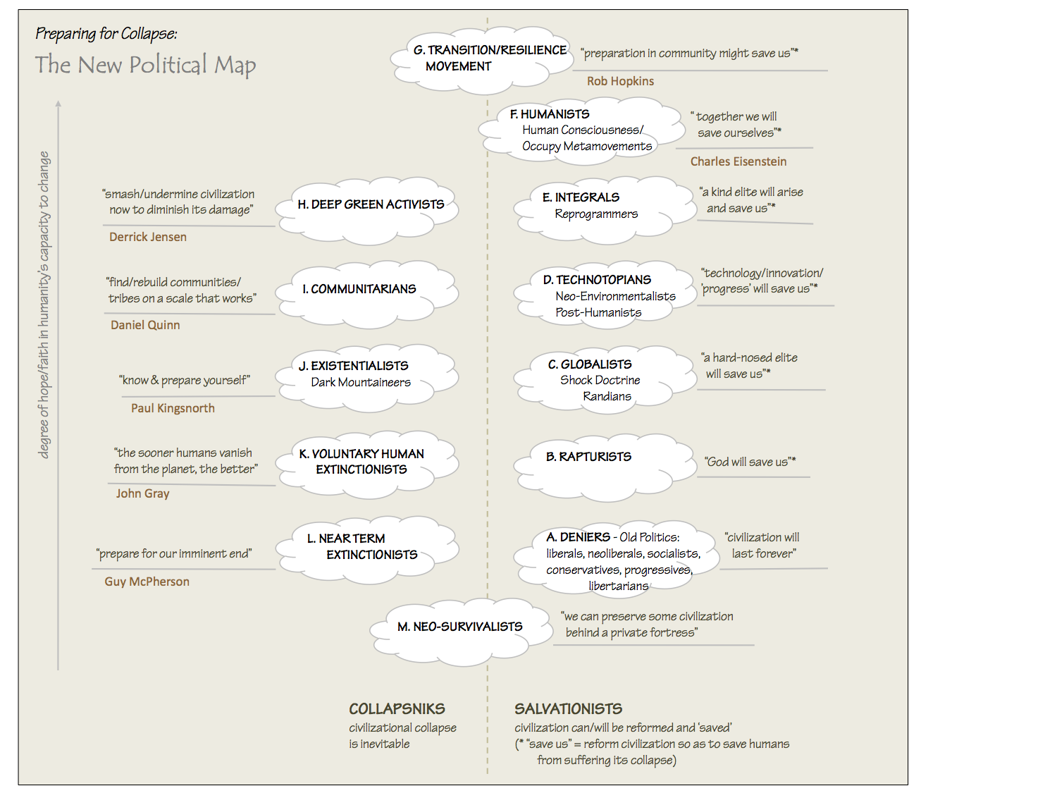
 Yesterday I got a new PC with a larger screen, and the first thing I did was check out how this blog looks on it using various browsers. What a shock. It looks awful. At the risk of scaring off other non-techie bloggers from doing anything fancy with their blogs, here’s what I learned: Yesterday I got a new PC with a larger screen, and the first thing I did was check out how this blog looks on it using various browsers. What a shock. It looks awful. At the risk of scaring off other non-techie bloggers from doing anything fancy with their blogs, here’s what I learned:
- You need to check how your theme, layout, graphics, tables and sidebars look with different browsers, and also different versions of each browser and different screen sizes of each version. If it looks fine with IE 5, it may still look dreadful with IE 6, and if it looks fine on a 1200 x 1600 pixel screen, it may look dreadful on a 600 x 800 screen. Many of my JPGs and GIFs are charts with words on them, and when I create them with PowerPoint and export them to Microsoft Image Composer to save them as JPG or GIF files, never wider than 450 pixels to that those with small screens won’t have trouble with them, they look perfect. And with Netscape 7 and IE 5.5 on a medium sized screen the text was crystal clear. But now I discover that on IE 6 much of the text in these JPG and GIF files looks ragged and blurry, and some of the colours of boxes look mottled, making the text hard to read.
- Every one of my posts is embedded in a table, set so that people who want to print them out (older readers who find reading on-screen hard, for example) can do so without having to tinker with print settings, and except for the right sidebar it will fit on an 8.5×11 page legibly. Within those tables I use text-wrap to conserve space and make the graphics look a bit more professional. But now I find that on a screen larger or smaller than my usual mid-size, the graphics frequently look wonky (the wrap-around doesn’t work properly because of different paragraph lengths on different sized screens), and information shown in table format sometimes gets truncated. And many readers also use text magnification settings on their browsers, which can produce the same unintended effects.
The bottom line is that I now understand why some readers thought my post on ‘good weblog design and layout’ was ironic: to many, perhaps most readers, my blog must look more like a kidnapper’s ransom note (with words glued every which way) than the snappy, semi-professionally laid out journal I had always imagined it to be. To these readers I apologize — I’m embarrassed to admit I had no idea, other than the occasional e-mail from a reader whose problem with my layout I was unable to reproduce.
But I’m also annoyed. Most of us are not techies, and when we get a tool that allows us to use indents, graphics, lists and tables, we expect that those tools will produce layouts that will work regardless of browser, version, screen size or text magnification. I’m not a big fan of MS Office but when I use these features in a Word document, they look fine on all screens and print fine on all printers. It is absurd and unreasonable that before we can safely use these basic functions in a blog post, we need to test out their appearance on different versions of different browsers with different screen sizes. Damn it, we’re here to write, not fiddle with HTML.
Looking at my lovely blog on a large screen on IE 6, I’m almost in tears. You can’t even read the right sidebar — beyond 1400 pixels width, a vertical navy blue bar suddenly appears at the right end of my blog (a heretofore invisible part of my Radio theme) rendering the black text atop it illegible. It’s almost enough to make you give up blogging. But I’m hooked, and chagrined but unrepentant. So if you find the look of How to Save the World amateurish and difficult to read, please persevere and understand that I’m just a crazy non-techie doing my best to write something interesting and perhaps informative. I’m just trying to save the world. Someone else will have to save the blogosphere. |


You have just experienced first-hand the difficulty designers and developers have with Microsoft. Their tools output stuff like that, but, because of market dominance, we have to deal with it. There are agreed-upon standards, and there are the standards that Microsoft follows. They don’t always coincide.
You can’t blame it on any one element of the Web ecosystem. It’s the whole thing. It’s not even just the fault of technologists. If users made an issue of this, esp early in the process, the market would have adjusted. Without starting over (impossible) Microsoft is just as powerless as anyone else.
For what it’s worth, i have a 19′ flatscreen monitor (equiv to a 20′ crt), IE 6, Windows XP, and your blog looks great when full screen or when reduced in size.
A year or so ago this very problem drove me to determine that I needed professional help in designing my weblog and website templates, with my main criteria being cross-browser compatibility. Mark Pilgrim did a fine job on my b.cognosco template and stylesheet, but even there it doesn’t render the same under IE as under Mozilla, Opera, or Safari, though it’s tolerable. It’s a nuisance and we end up with designs that are necessarily plain and feature-starved in an effort to accommodate as many browsers as possible. CSS offers some help, but learning CSS has proven more of a challenge than I am up to, and I find that fewer designers comprehend CSS than good web design. But you have hit on a key point — that we need to at least view our own sites in several different browsers, at several different resolutions.David Buchan recently made a post about linking a formatted PDF file to blog posts. I questioned why he would want to do this and offered a couple of alternatives. But in cases like yours, where graphics and lengthy text runs make formatting very important he might be onto something. Or not. I’ll have to think about it more.
Another “for what it’s worth” comment.I have an apple powerbook g4 (15″) and use Safari almost exclusively. Your site looks great on my machine. Professional and easy to read. What could be better? I understand COMPLETELY your frustrations. I’m a non-techie myself and have found my blog to be overwhelmingly maddening at times. (I have a couple of GRRR anti-Radio posts on my blog…) Ranting helps. At least for me. Plus, you always get a a couple of helpful comments (and some that just agree with you and feel your pain like this one.;>)
I only discovered your site a couple of days ago and I put any layout quirkiness down to browser issues. I use IE6 at 1280×1024 and the only thing that looks bad is the large space that occurs at the top of the central table. Mostly I’ve been following your posts with an RSS accumulator (Syndirella) where everything of yours I’ve seen looks pretty good. More important to me is the great content that you’ve been putting up, I love it that you’re outputting full article text to RSS. Don’t lose heart I’m about as techie as it gets and I don’t believe you can make anything that will look perfect for everyone, the best you can hope for is to get something that looks good for most people and that degrades gracefully for everyone else. Keep up the great work.
I’m looking at your site in IE 6 at 1400 x 1050 and it looks just fine.
Well, thanks, everyone, I feel a lot better. But if Mr. Winer hasn’t got a ready solution, I’m left to conclude there isn’t one.
Well, here’s a ready solution for you all (I’m surprised Dave W. didn’t think about it): Subscribe to Dave’s RSS feed in an aggregator.
1024×768 with IE6 latest and greatest and everything looks jake to me. Color variations are usually because of the color depth. If you don’t use 8 bit color (256 clors) eliminating photographs you can’t plan on the accomodating the lowest common denominator a 3 column blog in 800 pixels is a challenge if you ask me. I consider 1024 x 768 x 24 bit color to be the minimum I design for (as if I was a designer).
Well it looks fine from here Dave – at 1024×768 on a 17″monitor in Opera 7.11, IE6 and Moz. 1.5 – but I start reading you now in bloglines :-)
Win XP, IE6, Mozzila 1.4, Firebird 0.6.1, 1280×1024 32-bit – just the “large space that occurs at the top of the central table” on permanent links – That’s one of the reasons I started the 2nd blog. Here is a quote from the jmoran.com blog that explains it:
I’m enjoying it, but it is slow going.
Hi Dave,Stu Savory here, blogging from Germany. As you may not know, the rest of the world uses metric sized paper.A4 is different from your imperial(hiya, Dubya) 8.5 by 11 stuff.So if you want to rationise your printout format, it should be onto the common area of both paper sizes, so we ALL get a good printout, not just the yanks.Stu
Uh, Stu, Dave blogs proudly from Canada, which is actually metric, except in all matters pertaining to common usage. (Eg., realtors will tell you the square footage of a house, not the square metres, and paper still comes in 8.5×11″, alas, and all our printers etc. would probably garble DIN-A4 paper to bits since said printers are the same as in the US.) Anyway, we are metric, sort of, but not quite, ’cause we’re joined at the hip to the Americans. But let us keep our dignity, please, and don’t call us Yanks! ;-)
A right sidebar ? *scrolls* oh, yes, there is one !What would be cool would be a web service to wich you’d give an URl and some settings (screen and browser) and that will give you a screenshot of what the page looks like – shouldn’t be that hard to do and it may even already exist …
I think the whole notion of layout needs to be re-thought.Paper (letter, A4, whatever) has fixed dimensions, whereas a web pages can and will be viewed at many different sizes.I for one may go with full screen at times while at other moments I write and do IM simultaneous to browsing and don’t want to spare more than about a quarter of my screen for the browser.Accomodating pages like http://www.solvare.com/filer/plac2.htmlis not the solution, but a starting point…
You mentioned formatting things so they will print on 8.5×11 paper – in the UK and (I think) most of Europe, that paper size is unavailable. All the printers here in the UK print A4 as standard. This means that documents originating in the US have to be re-sized. Just something else to consider.
Dave:Left a note in my blog about your “rant and apology”. As the comments above mine here show, the design problem is creating a standard intended to accomodate folks who use a variety of browsers on a variety of screens, who read your site directly, who read it through any of dozens of accumulators, who print it out on at least two sizes of paper. Not an easy problem, and the reason that HTML’s designed to loosely control formatting. Just a reminder, though: The content’s the important thing. If I can read what you’ve got to say, I’m happy.jowo
I’m with Joel dave – its what you write that keeps me coming
Ditto (it looks greta on my old machin in W98, IE 5.0)
Also it’s a good idea to check what one’s site looks like in M$IE when image loading, javascript etc are turned off. Some sites I go to end up completely blank, others have image placeholders plopped over text (eg Washington Post)…yours however is readable, which is all I ask, so please don’t break it.