
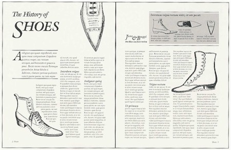
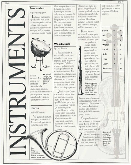
 A decade ago, Apple put out a 75-page book with this title, provided free to LaserWriter owners. It appears to be out of print, though I’ve seen it on e-Bay for $2 from time to time. It’s written for black-and-white hard-copy page layout, but many of the principles, with a little tweaking, also apply to web page layout. Here’s a synopsis: Planning & Organizing your Document: Considering the purpose of the communication, its intended audience, the impression you’re trying to create, document constraints (cost, time & resources for production), what design elements are appropriate: proportion (relative size of text, graphics and insets), direction (logical order and flow of the information), consistency (uniform look and feel), contrast and colour, restraint, spelling, grammar and punctuation. Typography (typefaces) and font (size): Limiting the number of typefaces (usually to one serif and one complementary sans-serif face on a page), good methods of emphasis (bold, italic, larger font) & bad methods of emphasis (mishmash of typefaces, underlining, fancy scripts), aligning text on the page (flush-left / ragged-right is usually best), ensuring adequate but not excessive spacing between letters, words, lines and paragraphs, and selective use of colour in text. Design Choices: How dividing the page into 2-4 columns of the same or different widths (3-5 columns for ‘landscape’ view pages) can help make lines of text readable and the positioning of graphics neat and proportioned, making headings attractive (e.g. by offsetting them from text, using wordart, surrounding them with white space, putting short headings at 90 degrees to the page, or putting them in reverse light-on-dark text boxes), how to lay out a resume (lots of white space at left), a press release (lots of subheadings, useful graphics), a business presentation (abstracts, useful graphics and insets), and a brochure (larger-font summary, creative illustrations, frequent subtitles, insets). See their example of a well-designed brochure above. Advanced Design: Adding visual interest by using a mix of heavy and light type for contrast, using intial caps and drop-caps, careful use of light (20% screen) greyscale illustrations behind text (as in the example immediately above), less-is-more use of white space, use of shadow boxes (see example below) and rules (vertical or horizontal lines and separators), Common Design Mistakes to Avoid: Distracting ‘rivers’ and ‘holes’ of white space, tombstoning (headings that disrupt the flow of the document so the reader loses his place), floating sub-headings (placed too close to the preceding paragraph so the reader associates them with what goes before instead of what follows), whispering (too small) and buried (too low in the page) headings and sub-headings, jumping horizons (text starting unevenly at the top of each column of a page), widows and orphans (a single word or single line stranded at the end of a column or page), over-use of rules and boxes, and too-small margins. I’ve written before about good weblog design and layout. And I know my blog is not a great example of design and layout, partially due to my lack of HTML skill and partly because if I spent more time on design I’d have less time for writing content. I’d love to know enough to use screens, curved text wraparound, drop-caps, shadow boxes, and increased line spacing. And I’d love to get rid of the annoying space at the top of the middle column of my permalink pages. Who do you think, from a purely aesthetic rather than functional point of view, has the best layout and design in the blogosphere? |
Navigation
Collapsniks
Albert Bates (US)
Andrew Nikiforuk (CA)
Brutus (US)
Carolyn Baker (US)*
Catherine Ingram (US)
Chris Hedges (US)
Dahr Jamail (US)
Dean Spillane-Walker (US)*
Derrick Jensen (US)
Dougald & Paul (IE/SE)*
Erik Michaels (US)
Gail Tverberg (US)
Guy McPherson (US)
Honest Sorcerer
Janaia & Robin (US)*
Jem Bendell (UK)
Mari Werner
Michael Dowd (US)*
Nate Hagens (US)
Paul Heft (US)*
Post Carbon Inst. (US)
Resilience (US)
Richard Heinberg (US)
Robert Jensen (US)
Roy Scranton (US)
Sam Mitchell (US)
Tim Morgan (UK)
Tim Watkins (UK)
Umair Haque (UK)
William Rees (CA)
XrayMike (AU)
Radical Non-Duality
Tony Parsons
Jim Newman
Tim Cliss
Andreas Müller
Kenneth Madden
Emerson Lim
Nancy Neithercut
Rosemarijn Roes
Frank McCaughey
Clare Cherikoff
Ere Parek, Izzy Cloke, Zabi AmaniEssential Reading
Archive by Category
My Bio, Contact Info, Signature Posts
About the Author (2023)
My Circles
E-mail me
--- My Best 200 Posts, 2003-22 by category, from newest to oldest ---
Collapse Watch:
Hope — On the Balance of Probabilities
The Caste War for the Dregs
Recuperation, Accommodation, Resilience
How Do We Teach the Critical Skills
Collapse Not Apocalypse
Effective Activism
'Making Sense of the World' Reading List
Notes From the Rising Dark
What is Exponential Decay
Collapse: Slowly Then Suddenly
Slouching Towards Bethlehem
Making Sense of Who We Are
What Would Net-Zero Emissions Look Like?
Post Collapse with Michael Dowd (video)
Why Economic Collapse Will Precede Climate Collapse
Being Adaptable: A Reminder List
A Culture of Fear
What Will It Take?
A Future Without Us
Dean Walker Interview (video)
The Mushroom at the End of the World
What Would It Take To Live Sustainably?
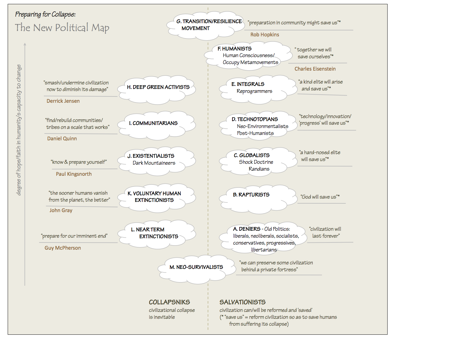
The New Political Map (Poster)
Beyond Belief
Complexity and Collapse
Requiem for a Species
Civilization Disease
What a Desolated Earth Looks Like
If We Had a Better Story...
Giving Up on Environmentalism
The Hard Part is Finding People Who Care
Going Vegan
The Dark & Gathering Sameness of the World
The End of Philosophy
A Short History of Progress
The Boiling Frog
Our Culture / Ourselves:
A CoVid-19 Recap
What It Means to be Human
A Culture Built on Wrong Models
Understanding Conservatives
Our Unique Capacity for Hatred
Not Meant to Govern Each Other
The Humanist Trap
Credulous
Amazing What People Get Used To
My Reluctant Misanthropy
The Dawn of Everything
Species Shame
Why Misinformation Doesn't Work
The Lab-Leak Hypothesis
The Right to Die
CoVid-19: Go for Zero
Pollard's Laws
On Caste
The Process of Self-Organization
The Tragic Spread of Misinformation
A Better Way to Work
The Needs of the Moment
Ask Yourself This
What to Believe Now?
Rogue Primate
Conversation & Silence
The Language of Our Eyes
True Story
May I Ask a Question?
Cultural Acedia: When We Can No Longer Care
Useless Advice
Several Short Sentences About Learning
Why I Don't Want to Hear Your Story
A Harvest of Myths
The Qualities of a Great Story
The Trouble With Stories
A Model of Identity & Community
Not Ready to Do What's Needed
A Culture of Dependence
So What's Next
Ten Things to Do When You're Feeling Hopeless
No Use to the World Broken
Living in Another World
Does Language Restrict What We Can Think?
The Value of Conversation Manifesto Nobody Knows Anything
If I Only Had 37 Days
The Only Life We Know
A Long Way Down
No Noble Savages
Figments of Reality
Too Far Ahead
Learning From Nature
The Rogue Animal
How the World Really Works:
Making Sense of Scents
An Age of Wonder
The Truth About Ukraine
Navigating Complexity
The Supply Chain Problem
The Promise of Dialogue
Too Dumb to Take Care of Ourselves
Extinction Capitalism
Homeless
Republicans Slide Into Fascism
All the Things I Was Wrong About
Several Short Sentences About Sharks
How Change Happens
What's the Best Possible Outcome?
The Perpetual Growth Machine
We Make Zero
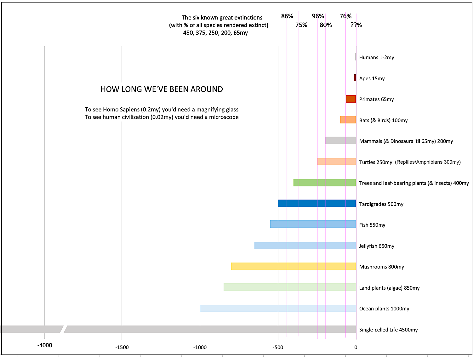
How Long We've Been Around (graphic)
If You Wanted to Sabotage the Elections
Collective Intelligence & Complexity
Ten Things I Wish I'd Learned Earlier
The Problem With Systems
Against Hope (Video)
The Admission of Necessary Ignorance
Several Short Sentences About Jellyfish
Loren Eiseley, in Verse
A Synopsis of 'Finding the Sweet Spot'
Learning from Indigenous Cultures
The Gift Economy
The Job of the Media
The Wal-Mart Dilemma
The Illusion of the Separate Self, and Free Will:
No Free Will, No Freedom
The Other Side of 'No Me'
This Body Takes Me For a Walk
The Only One Who Really Knew Me
No Free Will — Fightin' Words
The Paradox of the Self
A Radical Non-Duality FAQ
What We Think We Know
Bark Bark Bark Bark Bark Bark Bark
Healing From Ourselves
The Entanglement Hypothesis
Nothing Needs to Happen
Nothing to Say About This
What I Wanted to Believe
A Continuous Reassemblage of Meaning
No Choice But to Misbehave
What's Apparently Happening
A Different Kind of Animal
Happy Now?
This Creature
Did Early Humans Have Selves?
Nothing On Offer Here
Even Simpler and More Hopeless Than That
Glimpses
How Our Bodies Sense the World
Fragments
What Happens in Vagus
We Have No Choice
Never Comfortable in the Skin of Self
Letting Go of the Story of Me
All There Is, Is This
A Theory of No Mind
Creative Works:
Mindful Wanderings (Reflections) (Archive)
A Prayer to No One
Frogs' Hollow (Short Story)
We Do What We Do (Poem)
Negative Assertions (Poem)
Reminder (Short Story)
A Canadian Sorry (Satire)
Under No Illusions (Short Story)
The Ever-Stranger (Poem)
The Fortune Teller (Short Story)
Non-Duality Dude (Play)
Your Self: An Owner's Manual (Satire)
All the Things I Thought I Knew (Short Story)
On the Shoulders of Giants (Short Story)
Improv (Poem)
Calling the Cage Freedom (Short Story)
Rune (Poem)
Only This (Poem)
The Other Extinction (Short Story)
Invisible (Poem)
Disruption (Short Story)
A Thought-Less Experiment (Poem)
Speaking Grosbeak (Short Story)
The Only Way There (Short Story)
The Wild Man (Short Story)
Flywheel (Short Story)
The Opposite of Presence (Satire)
How to Make Love Last (Poem)
The Horses' Bodies (Poem)
Enough (Lament)
Distracted (Short Story)
Worse, Still (Poem)
Conjurer (Satire)
A Conversation (Short Story)
Farewell to Albion (Poem)
My Other Sites

I know there are nice blogs out there, such as the one by the guy who designed the new Harpers.org to look like his blog (or vice versa), but around here I think Real Live Preacher still gets the prize: simple but elegant design + fabulous graphics. Of course I haven’t seen everyone’s. So many blogs, so little time.
Michelle at Mandarin Design often has some good tips to help you with your HTML and CSS. I steal her ideas sometimes too, she’s a helpful lass.Stu Savory
Thanks Stu. I’ve used some of their ideas and helpful tools (they’re at mandarindesign.com if you’re looking for the site). You have to be careful since some of them don’t work with non-MS browsers. The ‘Peace overlay’ for example doesn’t work with Mozilla.
Dave,Great topic. I’d give high marks to:Loobylu.com — sure, it helps to be a professional artist, but the typography and colors are also well chosen.http://billscontent.com/weblog.php (Peoria Pundit) — Nice use of typefaces and shading with large headlines and photos to show what’s important. Not a surprising approach given his journalism background.http://homepage.mac.com/michelle_thompson/blog/ — A relative newcomer (choose the Mustard look from the menu; that’s my personal favorite). Good use of color and typography, even if she doesn’t use colors I’d have chosen.http://www.apple.com — Just about everything Apple does shows incredible design flair, and even their website is clean and elegant.Ron
Good choices Bill. I just can’t stomach Peoria Pundit’s content, though. The fact that he can advocate development of low-yield nukes betrays such a staggering ignorance of the lessons of history I have to wonder where he purchased his journalism degree.
Sorry, I meant Ron. I’m not good with names :-(
I “bought” it at Eastern Illinois University, where I was fully sympathetic with students group that advocated total disarmament, peace in our time, yadda yadda. Every single one of my political science profs were of the Democratic and liberal persuasion, although I cannot, in hindsight, say they were overly biased.My journalism degree has surprisingly little to do with my current political beliefs, other than I learned how to consider the facts objectively, and thus, changed my mind on certain issues.I simply came to the conclusion that pacifism don’t create peace anymore than wishing for a ham sandwich cures world hunger. In other words, I grew the Hell up. Being able to defend itself as efficiently and effectively as possible is a nation’s only real deterrent to war.If low-yield nuclear weapons increases that efficiency and effectiveness, then it is an option that must be explored.I advocate development of low-yield nukes because — as I made clear in my post — that someone *is* going to develop them. Right now the U.S. has limited options when diplomacy fails and we need to go to war. We can send in troops and fight and die or we can sit on the sidelines and lob over nuclear missiles. The second option causes massive destruction to people, buildings and the environment. Low-yield weapons are still horrible. But not as much as regular yield weapons. They are too practical and useful a weapon for someone to not develop them. I’d rather have that nation be the United States of America. Would you rather have it be North Korea? Syria? Iran?Like you, I’d rather have no nation develop them. Hell, I’d rather live in a world in which nuclear weaponry is not possible. But then, I also wish the Japanese never attacked Pearl Harbor and that al Qaeda never destroyed the WTC and attacked the Pentagon.I’d suggest reading Robert A. Heinlein’s “Starship Troopers” or his essays in “Expanded Universe” to read these ideas expressed more clearlythan I am capable of doing.And BTW, I bought the degree with what I earned working for the student newspaper and by washing dishes at a restaurant, and with student loans that I worked two jobs to pay off after graduation. Sorry for playing the “working class hero” card. But you brought it up.Enough about politics.I’d like to thank Ron for his nice comment about my site design. And, yes, my journalism background did have a huge effect on my site design. I wanted something that was simple, allowed for large, attention-getting headline-style titles, and also allowed for wide photographs when I wanted to use them.I am considering switching to just one side rail, about 150 percent the width of what I am using now. Some of the site navigation stuff I have now on my left rail are hardly ever used. Another site with a nice layout (in my opinion) is http://phillipcoons.com/ — Nice simple design, with space for daily photos.And I am sorry if this post is not clear. It’s late and I just got home from my second job, where I am earning the money to buy another degree, this one in secondary education.
Bill: First of all, my apologies for ranting against your blog post on nukes in the comments thread of an article on design, which was inappropriate, and for ranting here instead of on your blog, which was cowardly. I won’t compound that error by talking any more about politics in this thread, except to say my indiscretion was provoked by a sense of utter horror at what you were suggesting (both at your fear and your solution). I was so distraught by it I could not sleep last night. I overreacted. Such is the power of ideas.I agree with your thoughts on design, especially making more room for photos and graphics. I know three-column blogs with graphics more than 450px wide won’t fit on smaller (600 by 800px) screens, and 450px is a terrible constraint for presenting something visually important. My sidebars, though, are my electric ‘post-it’ notes, and short of using outlining for the blogroll I’m not sure I could give up that real estate easily.
“Such is the power of ideas.”Indeed. I couldn’t agree more.Thanks for the kind comments.I think we have the same goals .. but simply *very* different ideas on how best to accomplish them.
I liked Bill’s addition of Phillipcoons.com to the discussion. The use of a second column as a photo-specific column on that site is clever and something I’ve never seen implemented that way. My only adjustment might be to move that column to the far left because my eye is drawn instinctively to the color and imagery of the photos and therefore passes over the text in the first column, becoming trapped between the dotted lines bordering the pictures. If the photos were on the left, the eye could easily move into the main text of the blog and wouldn’t get caught on the photo column or fixated on the white space between the text and photos.I only wish I had the HTML skills to do more with my own site. Adding a third column to it yesterday just about taxed all I know. Time to crack the books!It’s interesting that Bill relied so heavily upon his journalism background in designing his site. I’ve actually seen posts on other blogs claiming that newspaper design is irrelevant to web design and that there are either no “rules” for the web or that the rules are so loose that they can be ignored. I don’t think that’s true, but I wonder if anyone else thinks we’re working in a medium where few or none of the old rules apply?Ron