
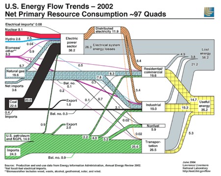
 Here’s a great example of how to use a graphic to convey a ton of information. It shows all the sources and uses of energy consumed by the US, and how much of it is lost, in a single picture. It’s from the Lawrence Livermore National Laboratory and it’s slide 31 of 50 in this PowerPoint deck by Marty Sereno of UCSD on Peak Oil. The whole deck is worth a read. Thanks to reader Ken Roberts for the link. |
Navigation
Collapsniks
Albert Bates (US)
Andrew Nikiforuk (CA)
Brutus (US)
Carolyn Baker (US)*
Catherine Ingram (US)
Chris Hedges (US)
Dahr Jamail (US)
Dean Spillane-Walker (US)*
Derrick Jensen (US)
Dougald & Paul (IE/SE)*
Erik Michaels (US)
Gail Tverberg (US)
Guy McPherson (US)
Honest Sorcerer
Janaia & Robin (US)*
Jem Bendell (UK)
Mari Werner
Michael Dowd (US)*
Nate Hagens (US)
Paul Heft (US)*
Post Carbon Inst. (US)
Resilience (US)
Richard Heinberg (US)
Robert Jensen (US)
Roy Scranton (US)
Sam Mitchell (US)
Tim Morgan (UK)
Tim Watkins (UK)
Umair Haque (UK)
William Rees (CA)
XrayMike (AU)
Radical Non-Duality
Tony Parsons
Jim Newman
Tim Cliss
Andreas Müller
Kenneth Madden
Emerson Lim
Nancy Neithercut
Rosemarijn Roes
Frank McCaughey
Clare Cherikoff
Ere Parek, Izzy Cloke, Zabi AmaniEssential Reading
Archive by Category
My Bio, Contact Info, Signature Posts
About the Author (2023)
My Circles
E-mail me
--- My Best 200 Posts, 2003-22 by category, from newest to oldest ---
Collapse Watch:
Hope — On the Balance of Probabilities
The Caste War for the Dregs
Recuperation, Accommodation, Resilience
How Do We Teach the Critical Skills
Collapse Not Apocalypse
Effective Activism
'Making Sense of the World' Reading List
Notes From the Rising Dark
What is Exponential Decay
Collapse: Slowly Then Suddenly
Slouching Towards Bethlehem
Making Sense of Who We Are
What Would Net-Zero Emissions Look Like?
Post Collapse with Michael Dowd (video)
Why Economic Collapse Will Precede Climate Collapse
Being Adaptable: A Reminder List
A Culture of Fear
What Will It Take?
A Future Without Us
Dean Walker Interview (video)
The Mushroom at the End of the World
What Would It Take To Live Sustainably?
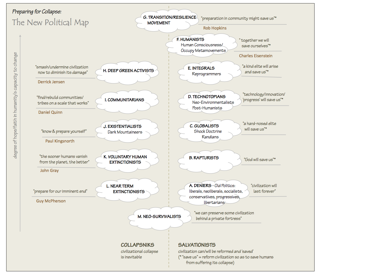
The New Political Map (Poster)
Beyond Belief
Complexity and Collapse
Requiem for a Species
Civilization Disease
What a Desolated Earth Looks Like
If We Had a Better Story...
Giving Up on Environmentalism
The Hard Part is Finding People Who Care
Going Vegan
The Dark & Gathering Sameness of the World
The End of Philosophy
A Short History of Progress
The Boiling Frog
Our Culture / Ourselves:
A CoVid-19 Recap
What It Means to be Human
A Culture Built on Wrong Models
Understanding Conservatives
Our Unique Capacity for Hatred
Not Meant to Govern Each Other
The Humanist Trap
Credulous
Amazing What People Get Used To
My Reluctant Misanthropy
The Dawn of Everything
Species Shame
Why Misinformation Doesn't Work
The Lab-Leak Hypothesis
The Right to Die
CoVid-19: Go for Zero
Pollard's Laws
On Caste
The Process of Self-Organization
The Tragic Spread of Misinformation
A Better Way to Work
The Needs of the Moment
Ask Yourself This
What to Believe Now?
Rogue Primate
Conversation & Silence
The Language of Our Eyes
True Story
May I Ask a Question?
Cultural Acedia: When We Can No Longer Care
Useless Advice
Several Short Sentences About Learning
Why I Don't Want to Hear Your Story
A Harvest of Myths
The Qualities of a Great Story
The Trouble With Stories
A Model of Identity & Community
Not Ready to Do What's Needed
A Culture of Dependence
So What's Next
Ten Things to Do When You're Feeling Hopeless
No Use to the World Broken
Living in Another World
Does Language Restrict What We Can Think?
The Value of Conversation Manifesto Nobody Knows Anything
If I Only Had 37 Days
The Only Life We Know
A Long Way Down
No Noble Savages
Figments of Reality
Too Far Ahead
Learning From Nature
The Rogue Animal
How the World Really Works:
Making Sense of Scents
An Age of Wonder
The Truth About Ukraine
Navigating Complexity
The Supply Chain Problem
The Promise of Dialogue
Too Dumb to Take Care of Ourselves
Extinction Capitalism
Homeless
Republicans Slide Into Fascism
All the Things I Was Wrong About
Several Short Sentences About Sharks
How Change Happens
What's the Best Possible Outcome?
The Perpetual Growth Machine
We Make Zero
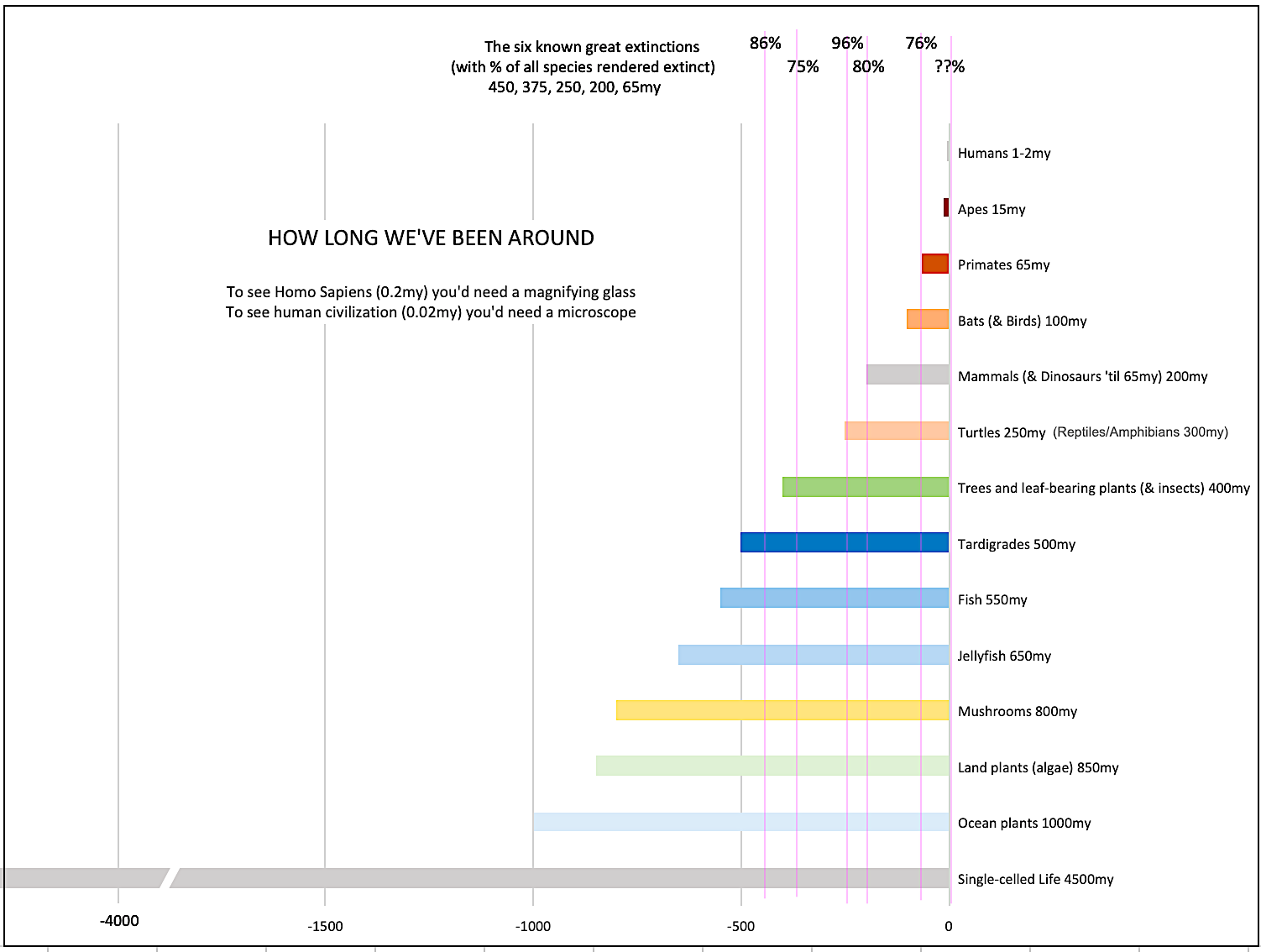
How Long We've Been Around (graphic)
If You Wanted to Sabotage the Elections
Collective Intelligence & Complexity
Ten Things I Wish I'd Learned Earlier
The Problem With Systems
Against Hope (Video)
The Admission of Necessary Ignorance
Several Short Sentences About Jellyfish
Loren Eiseley, in Verse
A Synopsis of 'Finding the Sweet Spot'
Learning from Indigenous Cultures
The Gift Economy
The Job of the Media
The Wal-Mart Dilemma
The Illusion of the Separate Self, and Free Will:
No Free Will, No Freedom
The Other Side of 'No Me'
This Body Takes Me For a Walk
The Only One Who Really Knew Me
No Free Will — Fightin' Words
The Paradox of the Self
A Radical Non-Duality FAQ
What We Think We Know
Bark Bark Bark Bark Bark Bark Bark
Healing From Ourselves
The Entanglement Hypothesis
Nothing Needs to Happen
Nothing to Say About This
What I Wanted to Believe
A Continuous Reassemblage of Meaning
No Choice But to Misbehave
What's Apparently Happening
A Different Kind of Animal
Happy Now?
This Creature
Did Early Humans Have Selves?
Nothing On Offer Here
Even Simpler and More Hopeless Than That
Glimpses
How Our Bodies Sense the World
Fragments
What Happens in Vagus
We Have No Choice
Never Comfortable in the Skin of Self
Letting Go of the Story of Me
All There Is, Is This
A Theory of No Mind
Creative Works:
Mindful Wanderings (Reflections) (Archive)
A Prayer to No One
Frogs' Hollow (Short Story)
We Do What We Do (Poem)
Negative Assertions (Poem)
Reminder (Short Story)
A Canadian Sorry (Satire)
Under No Illusions (Short Story)
The Ever-Stranger (Poem)
The Fortune Teller (Short Story)
Non-Duality Dude (Play)
Your Self: An Owner's Manual (Satire)
All the Things I Thought I Knew (Short Story)
On the Shoulders of Giants (Short Story)
Improv (Poem)
Calling the Cage Freedom (Short Story)
Rune (Poem)
Only This (Poem)
The Other Extinction (Short Story)
Invisible (Poem)
Disruption (Short Story)
A Thought-Less Experiment (Poem)
Speaking Grosbeak (Short Story)
The Only Way There (Short Story)
The Wild Man (Short Story)
Flywheel (Short Story)
The Opposite of Presence (Satire)
How to Make Love Last (Poem)
The Horses' Bodies (Poem)
Enough (Lament)
Distracted (Short Story)
Worse, Still (Poem)
Conjurer (Satire)
A Conversation (Short Story)
Farewell to Albion (Poem)
My Other Sites


The entire powerpoint presentation is excellent! Highly recommended to bring you up to speed on peak oil. I was intrigued by his claim that nuclear fusion had a EROEI of less than 1.0. I had no idea.
What a great diagram!The energy losses in electrial transmission is much greater than I expected. Would a move to more on-site production (supported by electrical grid backup and excess production sharing) help with that 26.3% loss? Assuming of course that one has already taken steps to improve the efficiency of the devices they have that use electricity.It’s a huge opportunity, and I was surprised that it’s bigger even than the opportunity in improving vehicle efficiencies.Thanks again Dave!
hithe off-the-cuff comment about nuclear EROEI being < 1.0 in the 1960’s was a little cryptic/misleading. Much of the fissionable uranium prepared in the 1960’s was for making bomb cores, and for selling nuclear reactor fuel to other countries. Nuclear fission using currently available uranium ore still has an EROEI > 1.0, but there is a limited amount of high quality uranium ore. There is a small amount of uranium in sea water, too, but it’t not even vaguely practical to extract it as an energy source.cheers,marty