
The enormous inconsistencies and dubious premises underlying some recent reports about actual vs reported CoVid-19 death rates in Canada cast serious doubt upon the reliability of the findings and conclusions in several of these reports, which are in some cases being used to make critical decisions about the pandemic.
They also raise serious questions about the competence of journalists reporting on health issues, and in particular their capacity to think critically and ask appropriate questions about the data and assumptions behind the reports they are publicizing. Just because an “expert” says something is true, doesn’t make it so, and when the claims of various authorities diverge wildly (and hence make easy headlines), this lack of journalistic capacity, IMO, borders on professional negligence.
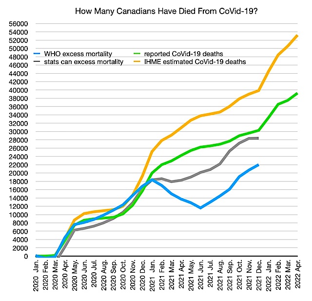
The chart above shows cumulative reported Canadian CoVid-19 deaths (in green); the total to date is about 40,000. Because the estimated actual number of deaths according to IHME (yellow) has whipsawed all over the place since the pandemic began, I became curious, and concerned, about what methodology they were using. It turns out that over the past two years they have used a whole series of completely inconsistent methodologies, abandoning several entirely in favour of other models with wildly different assumptions.
Some of these models concluded that Canadian CoVid-19 deaths were being underreported by a factor of up to four times. Why? Because those are the only death data they could get to ‘fit’ with their assumptions about IFR, CFR, and other factors in their models. They apparently made no attempt to understand how, given the history of thoroughness, skill and depth of data collection and analysis of Canada’s very accomplished and long-established epidemiologists, they could be so utterly incompetent at such a straight-forward task. So rather than question their assumptions, or attempt to resolve how such extreme underreporting could have occurred, they just disregarded the incongruity and went with the models. Until the models were proved preposterous, when they switched, without explanation or apology, to completely different models. In many professions, this would justifiably be described as misconduct.
Knowing that the Canadian professionals could not have been so incompetent in their data-gathering, I looked at some evidence that would either support or contradict these models. I used Statistics Canada’s excess deaths data — its report on total deaths from all causes, and the variance from previous years’ averages. This data is notoriously slow to compile, because the data has to come from the provincial authorities and local hospitals and facilities, which are in some cases seriously backlogged. But once it is in, it is good data. It is in, now, for the period up to December 31, 2021, and that data is shown in grey on the chart above.
This data has consistently confirmed what has also been found in many European countries with advanced health-care systems — that the reported CoVid-19 deaths were remarkably consistent with excess deaths in the same period. In some cases, there were other causes for excess deaths (like the heat dome in the Pacific Northwest last summer), but for the most part, health measures that had been put in place have actually reduced the number of deaths from non-CoVid-19 causes (influenza, accidents etc.) below historical normals, such that, even given that data collection is not perfect, and suffers from considerable lags, the reported number of CoVid-19 deaths in Canada and many Western European countries aligns very closely with excess deaths totals over the same period.
Disgruntlement with wildly inaccurate, whipsawing models based on flawed and quickly-abandoned assumptions, led a group of statisticians to try to develop a global database of normal and excess deaths, so that actual death tolls could be more accurately, and consistently, assessed. The World Mortality Database (WMD) was born, and many health authorities began using its data in place of those based on fragile and flip-flopping models like IHME’s.
Within a couple of months, IHME again abandoned its most recent model and switched to using WMD or equivalent excess deaths data for its new estimates, but only for the US and selected Western European countries where the new data still ‘fit’ its previous assumptions about IFR and CFR.
So, for example, in May 2021, IHME’s old model said that actual deaths to that date were 905,000 in the US, 50% more than had been officially reported. By September 2021, they claimed actually US deaths had already exceeded one million, again 50% more than officially reported. But two months later, in November 2021, they estimated, using their new model, that deaths to date were just 900,000 — less than they had estimated they had been six months earlier, despite the intervening Wave 4 toll, and now only about 10% more than had been officially reported.
Meanwhile, the WMD excess deaths data for Canada and some other countries just didn’t fit their new model assumptions, so IHME continued to estimate that Canada, unlike the US, must be incompetent in tracking CoVid-19 deaths, since to fit their model actual deaths must have been at least 35% higher than reported deaths, and would continue to be do in future. So they continue to claim 54,000 Canadians have died so far, not the 40,000 that have been officially reported, or which track excess deaths data.
The hapless and hopelessly-underfunded WHO, which has bounced from blunder to blunder, finally got on board with using excess deaths as a base-line for their estimates last month. But they seem to continue to have problems with numbers, since the excess deaths data for Canada they are using (which I have copied carefully from their new database) is shown in blue above. Their report doesn’t talk about Canada, other than to say that Canada’s reported numbers are reasonably accurate, while the actual numbers for the US are 75,000 deaths (about 8%) more than officially reported.
Because neither the IHME nor the WHO data make sense, I looked at one more source to see if I could substantiate the reasonableness of the data Canada’s hard-working health professionals, who have no earthly reason to lie about it, have been providing.
Sadly, the Canadian model I next examined was even more ridiculous. I read a CBC report based on this model that claimed that some provinces’ death data (including that of my home province of BC) was low by a factor of 3-4x (and had earlier been low by a factor of 5-7x). The model also claims that Québec has vastly over-counted its CoVid-19 death toll (but why?).
The modellers included a link to their data tables, and the links on those tables took me to more detailed tables. And it appears they are still making the assumptions that the IHME model has, at least for selected countries, abandoned. They assume that, from other data, they ‘know’ the IFR and CFR, and based on that, and based on further assumptions about what proportion of the population has been infected, they have ‘backed in’ to an estimate of how many have actually died. Suffice it to say that their estimates, which even exceed IHME’s preposterous numbers, are alarming, eye-catching to lazy journalists, and completely incompatible with any understanding of how epidemiological data is rigorously collected in this country. Their forecasts for the future, which hopefully aren’t being taken seriously by decision-makers, project that in the months ahead nearly half of actual Canadian CoVid-19 deaths will continue to go uncounted. Their wacky model also claims that over 300,000 Canadian CoVid-19 deaths have been averted by vaccines alone, almost 10x the official death toll.
So, how many Canadians have actually died from CoVid-19? The data suggests that the reported 40,000 death toll is not far off. It also suggests that the precautions we took for the pandemic (which we have now been encouraged to abandon) have modestly reduced deaths from other causes, such as influenza, and probably cut the death toll to a third of what it could otherwise have been.
There is something else that seems to have been overlooked in the myopic reporting in most of the Canadian media — the slope of the green line in the chart above. It’s basically unchanged over the past 16 months, and not sloping down at all. That slope represents 1,250 avoidable Canadian deaths every month, about 42 every day.
If only the politicians, of every stripe, were half as diligent at collecting and using the evidence at hand to make policy decisions in the best interest of their citizens (rather than their popularity), as our health care professionals were, until the decisions were wrenched from their hands.


