The Vlogbrothers, John & Hank Green, have to be two of the smartest and most creative people on the planet. They’re both extraordinary authors, and world-class science and culture journalists. They can also be disarmingly funny, and even outrageous.
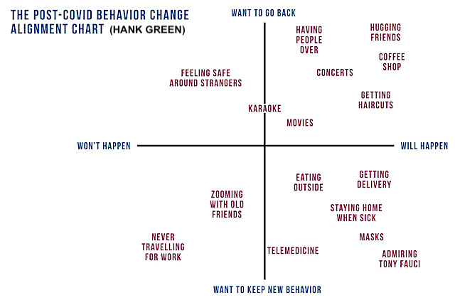
Hank recently invented something he calls the Post-CoVid Behaviour Change Alignment Chart. It depicts all the things we do since CoVid-19 that we didn’t do before, and all the things we used to do before CoVid-19 that we don’t do now. Each activity is placed on a 2×2 matrix (Hank’s is shown above) depending on how seriously you want to go back to pre-CoVid-19 behaviour (top of chart) or how seriously you want to retain your new behaviours once CoVid-19 has ended (bottom of chart). Alignment on the left/right axis indicates how unlikely (left of chart) or likely (right of chart) you’ll get your wish to do that.
This is the kind of brilliant invention we’re used to from the brothers Green. It can help you set your intention for future behaviours and priorities, instead of just following the crowd back to pre-CoVid-19 “normal”. It can help you understand why you’re struggling (if there are lots of things at the topmost area of your chart). It can help you see just how much your behaviours have, and have not changed, over the last year. It can show you how resilient you are (if your stuff is mostly at the bottom of the chart rather than the top). It can help you challenge unthinking decisions of others to get you to go back to “normal” (eg going back to the office, or to school) which may be both unnecessary and not in your best interests. And it can also show you what you really care about (stuff at the very top or very bottom of the chart).
It’s also a brilliant invention because it pretty much says it all. You don’t need a lot of thought to fill it in or to interpret it, even if it’s someone else’s chart. In fact, seeing similarities between yours and another’s chart could be a conversation-starter, or the start of a friendship.
I even wonder whether it could be adapted for other purposes, like ice-breaking in new groups or even dating: Maybe put the things/activities you love the most and loathe the most on one axis, top-to-bottom, and the things that occupy (too) much of your time versus those that you never have time to do on the other axis, right-to-left.
My situation is different from Hank’s. I’m retired and he’s not. I live in a place that is sufficiently remote that it has no home delivery, and in a country that does not allow voting by mail. And unlike Hank, I don’t really like most people, or crowds, all that much. So my chart doesn’t look much like Hank’s:
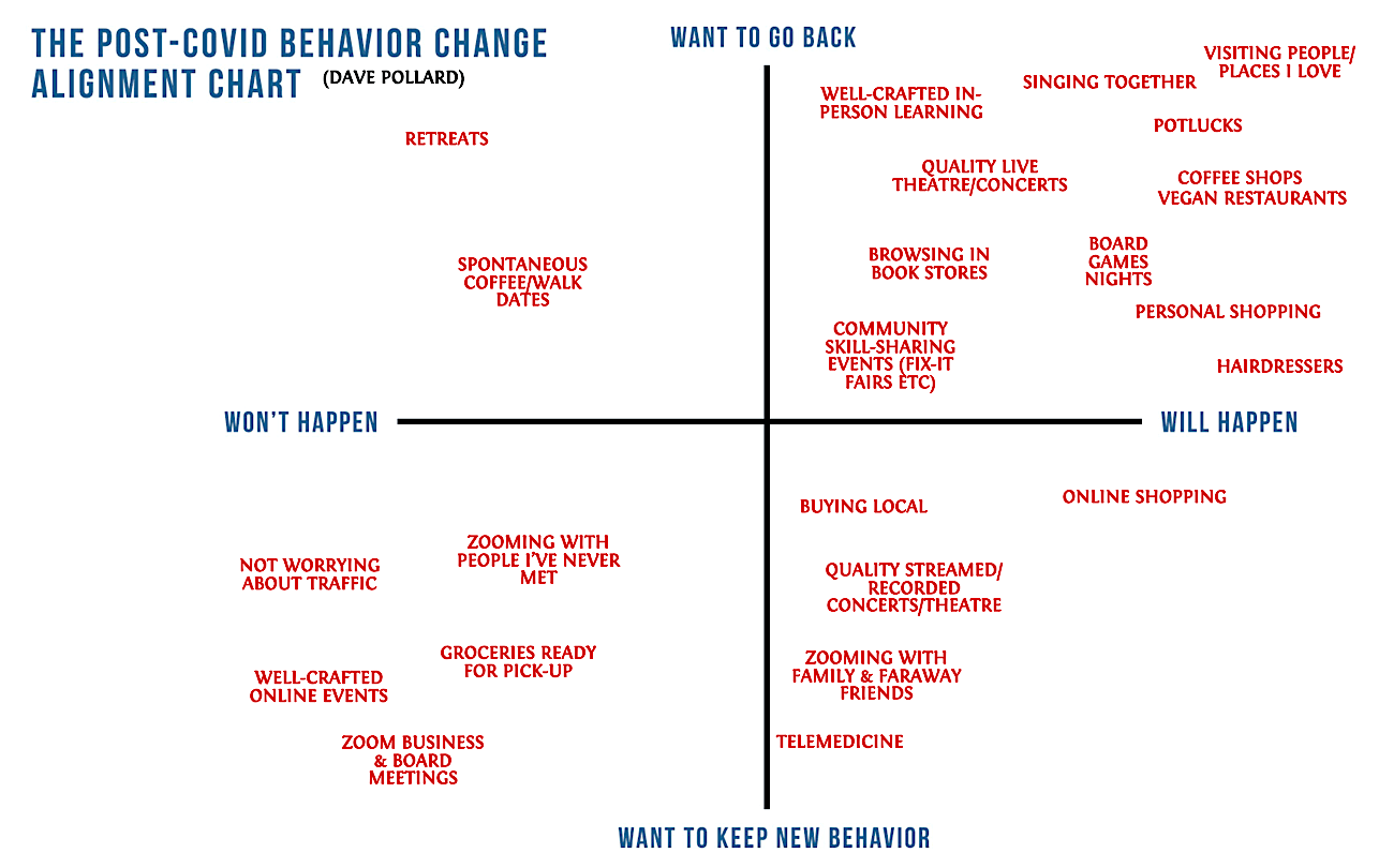
It tells me, in a way I hadn’t thought about, which of my behaviour changes in the past year have been temporary (above the line), and which are likely to be permanent (below the line). It also gets me thinking about the things to the left of the line, things I’d like to do again, or keep doing, that (either because of my own reticence or because they won’t be available after the pandemic) I probably won’t do, or be able to do. Maybe that will prompt me to find some way to do them after all.
Here’s a blank chart, from Hank, if you want to have a go at your own. And here’s Hank’s video where he talks about his invention. Awesome stuff.
