
As governments and health authorities keep altering, suppressing and recalculating their CoVid-19 data, I’ve been tracking the numbers right from the start, in an attempt to learn some lessons about pandemics from my brief stint with a team of epidemiologists a decade ago.
As I’ve said from the start, I’m not a health expert. My role with the Ministry of Health was in information processing and analysis, but I did learn a lot about the nature, causes, and management of pandemics from the hard-working professionals I worked with.
This is a recap and update to my earlier posts on CoVid-19. I’ll start with the data — such as it is.
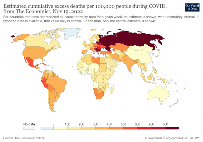
The map above, based on excess deaths data compiled from several sources and some estimates from The Economist where data was missing or lagging, essentially shows which countries have fared better or worse during the pandemic. There would appear to be three main factors to account for the vast differences between countries:
- Countries whose citizens have been exposed to many diverse viruses during their lives and have therefore developed a relative immunity (such as many central African nations) appear to have relatively very low death rates from the disease, even adjusting for poorer reporting.
- Countries that imposed restrictions on movement, mandated the use of masks and isolation when infected, and/or had robust health systems that could cope with heavy hospital loads and could quickly introduce new treatments, avoided the worst of the early, higher-mortality variants and “flattened the curve”, reducing the death toll by on average 2/3 in those countries.
- Countries with high levels of diabetes, obesity, and preexisting immune system and other health problems, or which faced high levels of resistance to any restrictions on movement or behaviour from citizens, or whose governments basically left all decisions up to individuals’ discretion, or waffled back and forth on restrictions, fared worst.
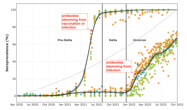
The second chart, above, shows all Canadian seroprevalence samples taken during the pandemic, from the CoVid-19 Immunity Task Force. The lower curve shows that across Canada CoVid-19 infections were kept to only about 7% of the population for nearly two years prior to the emergence of Omicron this past January, as a result of a combination of vaccinations (the upper curve) and high levels of self-isolating and masking. This “flattened the curve” and saved thousands of lives. While Omicron is much more vaccine-resistant, it is also significantly less likely to cause hospitalization or death.
Data showing the prevalence of the disease in public water supplies show a similar pattern to seroprevalence (blood test) data.
Countries where vaccine ‘hesitancy’ was high, or where resistance to self-isolating and masking was strong, had seroprevalence curves more like the grey curve in the centre of the above chart — much more dependent on inoculation through infection rather than vaccination, and many times more deaths and hospitalizations, especially early in the pandemic.
We are not out of the woods yet. As vaccines wear off and new vaccine-resistant variants emerge, we could find ourselves having to go through this all over again, at least if some of the new variants prove to be more deadly. It wouldn’t be the first time this happened. And there’s overwhelming evidence that if a new highly-deadly variant (or new infectious disease entirely, likely stemming from bird flu) emerges in the next few years, we will make the same mistakes we did this time.
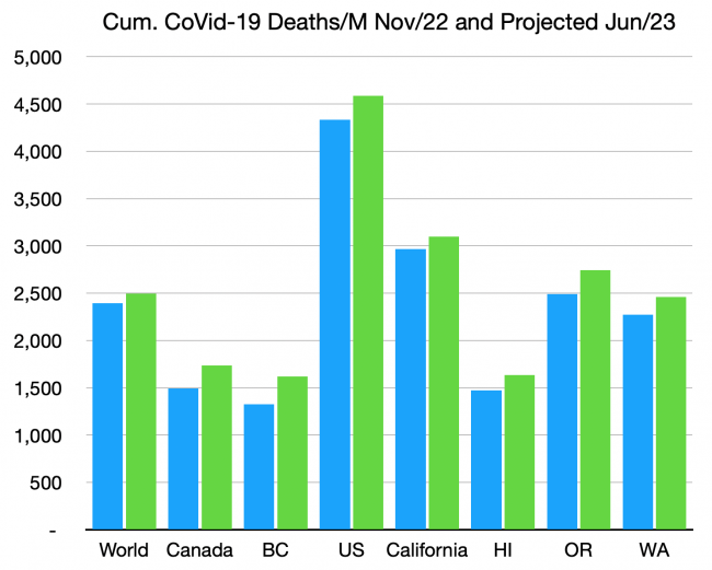
The third chart, above, shows the estimated actual death toll to date for selected jurisdictions. The estimates are based on excess deaths data assembled from several sources, not from ‘reported’ deaths, which are now all over the map in frequency and reliability. The numbers are per million citizens.
5,000 deaths per million, which the US is creeping up on, equates to one citizen in every 200 killed by this terrible disease. For those over 70 years of age or with weakened immune systems, the death toll is ten times higher than that.
We still have no idea of what the toll of Long CoVid will be, but it’s certain to afflict many times the number who died from the disease. Our failure to continue to use masks in indoor and crowded locations, to test and self-isolate when infected, and to get the latest vaccinations, will increase the future number of deaths, Long CoVid victims, and hospitalizations proportionally. The green bars above show how much the death toll is expected to rise even if no new more-dangerous variants arise. We are still in the middle innings of this disease.
Between 70 and 95% of people in all North American jurisdictions (and much of the rest of the world) have already contracted the disease at least once, and despite this fact, and all vaccination efforts, the death toll continues to rise at between 1-2 people per million citizens, every day.
The consensus of several analyses is that about 2% of people throughout almost every jurisdiction in the world, and including every part of North America and Europe, have been infected in just the past 10 days and are hence actively infectious to others. That’s one out of every 50 people in that restaurant, on that bus or train, or attending that event.
This also means that you have a better-than-50%-chance of getting it again some time in the next year. If you get it, probably from a friend or family member or some sneezer at a party or store or local event, you’ll probably be OK, unless you’re old, or health-compromised, or… unlucky.
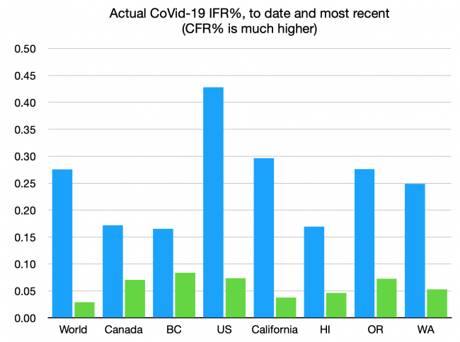
If you do get it, the chart above shows your current chances of dying. That’s true even if you’re asymptomatic, which most of those getting infected now are. We seem to have decided that the rates for the most recent variants, shown in the green bars, are an acceptable risk — about one in 2,000. If you’re old or immunocompromised, again, the odds are ten times worse. Still, far less than the rates of the earlier variants, which overwhelmingly took down the unmasked and the unvaccinated. We can only hope that the next variant, or the next pandemic, doesn’t look like the early variants, that had an IFR of nearly 1%, or some of the scarier plagues of our history, with IFRs ten times higher again.
And there will be a next one.
This last chart is just for the data geeks:
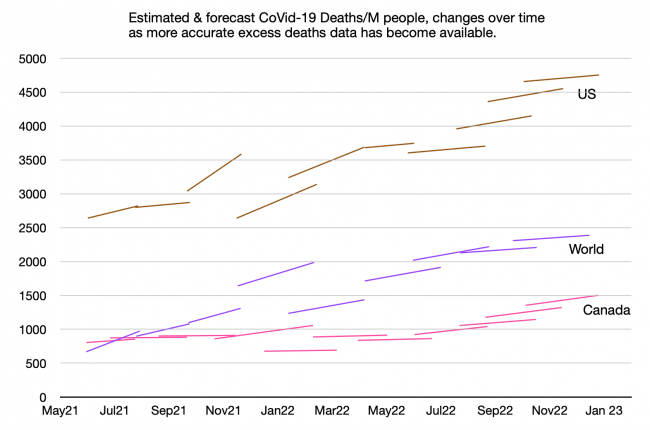
Some of the early guesses about actual deaths and cases were enough to make your head explode. In some cases the assumptions were circularly dependent — so if one was off by a factor of ten (which happened, especially for case data and data for some remote countries), so were the rest of the assumptions on which the model was based.
This chart shows the estimates and projections of total deaths per million people, for Canada, the US, and the entire world. The early estimates, with the sudden jarring changes, are mostly from IHME. The left-point of each line is their estimate of how many had died at that time, and the right-point is their projection for (usually three months into) the future. The lessons from this chart:
- The ‘flat’ and ‘flattening’ lines show the times when we were about to declare victory — when we thought CoVid-19 was past its peak and would soon be history.
- None of the three curves is flattening, and most of the lines start at a point higher than the last projection.
- Canadians have finally woken up to the fact that this is a long game and our early caution was not grounds for letting up later. The per-capita death toll in Canada is now rising faster than that of the US. Our complacency is unwarranted. And the political muzzling of advocates for continued safeguards is tragic.
As I said in an earlier summation, there is no question which ‘side’ has been consistently winning this 30-month-long war of wills, wits and adaptation.
Nature keeps reminding us she always bats last.


According to the map it seems your favorite country hasn’t done very well.