
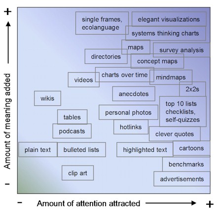
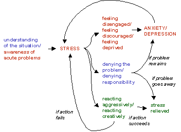
 In my recent article on Adding Meaning and Value to Information, I summarized the processes, ‘end-products’ and tools that we use to understand, to derive meaning from information. A lot of the end-products and tools mentioned in that article are visualizations, organizations of information into tableaux. Such visualizations, like the extraordinary one above from Lawrence Livermore National Lab that effectively captures forty pages of data on a single page, not only add meaning and help us understand, they are useful for capturing and holding our attention (long enough to understand) in the first place. Here’s a very subjective chart showing 25 methods of attracting attention to written material, how successful, on average, these methods are at grabbing (“eyeballs”) and holding (“stickiness”) our attention, and how much, on average, these methods actually add to reader comprehension: So what is it about the media and techniques at the right end of the chart above that grabs our attention, even when they may not have much to say? They say brevity is the soul of wit, and what characterizes the attention-getters most, I think, is their conciseness. Even the energy chart at the top of this post, while it takes some effort to absorb, is concise compared to the mind-numbing and un-navigable forty pages of tables it effectively replaces. We are attracted to information that is simple, memorable and easy to absorb. That makes us suckers, alas, for oversimplifications, a weakness that politicians and corporate marketers exploit well, and which the mainstream media pander to. We are likewise attracted to information that engages us interactively in its interpretation and use. When we see tables of survey results we compare where we stand versus the respondents in the survey. We print out the checklists so we can check off each box later. We take self-quizzes and participate in (well-designed and interesting) polls and surveys, even the most inane ones — it’s fun, and it’s almost as if we can’t help ourselves. We bookmark top 10 lists and memorize and forward on to others clever, pithy quotes, because they’re memorable and make us sound witty and profound by association. Crafting visualizations and other reorganizations and syntheses of information in such a way that they are both attractive and meaningful takes a rare talent, and it is more an art than a science. The energy chart at the top of this article, or the famous Charles Menard graphic depicting Napoleon’s losses on his march to Russia, are works of extraordinary thought, skill and imagination. There is no course that teaches you how to invent such brilliant, compelling and meaningful representations of mounds of tedious data. There should be, however. These are true masterpieces. Sometimes a representation of information can be compelling because it resonates with the worldviews, the ways of perceiving and understanding, of others. The following systems thinking graphic of mine, showing the vicious cycle of depression, has popped up all over the Internet since I posted it a couple of years ago: But just as we are prone to oversimplifying complex information, we need to take care not to try to apply systems thinking, mindmapping and other techniques where they are not appropriate. Among the features of complex systems are the impossibility of knowing all the variables, the absence of simple causal relationships, and the inability of predicting outcomes in such systems. A systems thinking diagram of any social or ecological system (e.g. one that purported to show ‘the solutions’ to global poverty) would necessarily be incomplete and misleading, a dangerous oversimplification that would inevitably lead to ineffective or even dysfunctional decisions and actions. Unfortunately, while our intuition and subconscious (if we listen to them and trust them) are pretty good tools for dealing with complex system problems and challenges, I know of no visualization or similar tool that is helpful in such situations. The closest thing I know of to a shareable, social tool that helps us address complex situations is narrative, the detailed, context-rich stories that indigenous peoples (and the rest of us, if we’re wise, and if we have the discipline to listen) tell each other. Open Space and other methodologies for grappling with ‘wicked’ problems depend significantly on story-telling as a means of knowledge transfer, learning, and hence personal decision-making in such situations. If you know of other tools, techniques and methodologies that work well in complex systems, please let me know. (That’s another way of getting people’s attention: asking questions and asking for help — again because it engages us to interact.) Why are the tools and techniques in the top half of the attention/meaning chart above so effective at adding meaning and understanding to information? I think this is relatively easy to explain: show me don’t tell me. We understand better when we’re shown what something means, or how to do something, rather than just told. All of these high-meaning-adding tools demonstrate rather than simply relating meaning, which ties directly into the cognitive learning processes we have used since we first appeared on the planet. What other tools exist, and what else can we do, as writers with important information to convey, to catch readers’ attention (honestly, not deceptively), and to demonstrate its meaning to them without oversimplifying? If you had a friend who’s idea of interesting information was what Brad Pitt’s baby had for breakfast today, or the stuff in the local crime blotter, how would you go about getting their attention on global warming, or disease pandemic preparation, or the End of Oil, or ending global poverty, and then conveying these terribly complex challenges and some of the approaches that might address them, in a way that would have meaning to them? If we can answer that question, it could change everything. |
Navigation
Collapsniks
Albert Bates (US)
Andrew Nikiforuk (CA)
Brutus (US)
Carolyn Baker (US)*
Catherine Ingram (US)
Chris Hedges (US)
Dahr Jamail (US)
Dean Spillane-Walker (US)*
Derrick Jensen (US)
Dougald & Paul (IE/SE)*
Erik Michaels (US)
Gail Tverberg (US)
Guy McPherson (US)
Honest Sorcerer
Janaia & Robin (US)*
Jem Bendell (UK)
Mari Werner
Michael Dowd (US)*
Nate Hagens (US)
Paul Heft (US)*
Post Carbon Inst. (US)
Resilience (US)
Richard Heinberg (US)
Robert Jensen (US)
Roy Scranton (US)
Sam Mitchell (US)
Tim Morgan (UK)
Tim Watkins (UK)
Umair Haque (UK)
William Rees (CA)
XrayMike (AU)
Radical Non-Duality
Tony Parsons
Jim Newman
Tim Cliss
Andreas Müller
Kenneth Madden
Emerson Lim
Nancy Neithercut
Rosemarijn Roes
Frank McCaughey
Clare Cherikoff
Ere Parek, Izzy Cloke, Zabi AmaniEssential Reading
Archive by Category
My Bio, Contact Info, Signature Posts
About the Author (2023)
My Circles
E-mail me
--- My Best 200 Posts, 2003-22 by category, from newest to oldest ---
Collapse Watch:
Hope — On the Balance of Probabilities
The Caste War for the Dregs
Recuperation, Accommodation, Resilience
How Do We Teach the Critical Skills
Collapse Not Apocalypse
Effective Activism
'Making Sense of the World' Reading List
Notes From the Rising Dark
What is Exponential Decay
Collapse: Slowly Then Suddenly
Slouching Towards Bethlehem
Making Sense of Who We Are
What Would Net-Zero Emissions Look Like?
Post Collapse with Michael Dowd (video)
Why Economic Collapse Will Precede Climate Collapse
Being Adaptable: A Reminder List
A Culture of Fear
What Will It Take?
A Future Without Us
Dean Walker Interview (video)
The Mushroom at the End of the World
What Would It Take To Live Sustainably?
The New Political Map (Poster)
Beyond Belief
Complexity and Collapse
Requiem for a Species
Civilization Disease
What a Desolated Earth Looks Like
If We Had a Better Story...
Giving Up on Environmentalism
The Hard Part is Finding People Who Care
Going Vegan
The Dark & Gathering Sameness of the World
The End of Philosophy
A Short History of Progress
The Boiling Frog
Our Culture / Ourselves:
A CoVid-19 Recap
What It Means to be Human
A Culture Built on Wrong Models
Understanding Conservatives
Our Unique Capacity for Hatred
Not Meant to Govern Each Other
The Humanist Trap
Credulous
Amazing What People Get Used To
My Reluctant Misanthropy
The Dawn of Everything
Species Shame
Why Misinformation Doesn't Work
The Lab-Leak Hypothesis
The Right to Die
CoVid-19: Go for Zero
Pollard's Laws
On Caste
The Process of Self-Organization
The Tragic Spread of Misinformation
A Better Way to Work
The Needs of the Moment
Ask Yourself This
What to Believe Now?
Rogue Primate
Conversation & Silence
The Language of Our Eyes
True Story
May I Ask a Question?
Cultural Acedia: When We Can No Longer Care
Useless Advice
Several Short Sentences About Learning
Why I Don't Want to Hear Your Story
A Harvest of Myths
The Qualities of a Great Story
The Trouble With Stories
A Model of Identity & Community
Not Ready to Do What's Needed
A Culture of Dependence
So What's Next
Ten Things to Do When You're Feeling Hopeless
No Use to the World Broken
Living in Another World
Does Language Restrict What We Can Think?
The Value of Conversation Manifesto Nobody Knows Anything
If I Only Had 37 Days
The Only Life We Know
A Long Way Down
No Noble Savages
Figments of Reality
Too Far Ahead
Learning From Nature
The Rogue Animal
How the World Really Works:
Making Sense of Scents
An Age of Wonder
The Truth About Ukraine
Navigating Complexity
The Supply Chain Problem
The Promise of Dialogue
Too Dumb to Take Care of Ourselves
Extinction Capitalism
Homeless
Republicans Slide Into Fascism
All the Things I Was Wrong About
Several Short Sentences About Sharks
How Change Happens
What's the Best Possible Outcome?
The Perpetual Growth Machine
We Make Zero
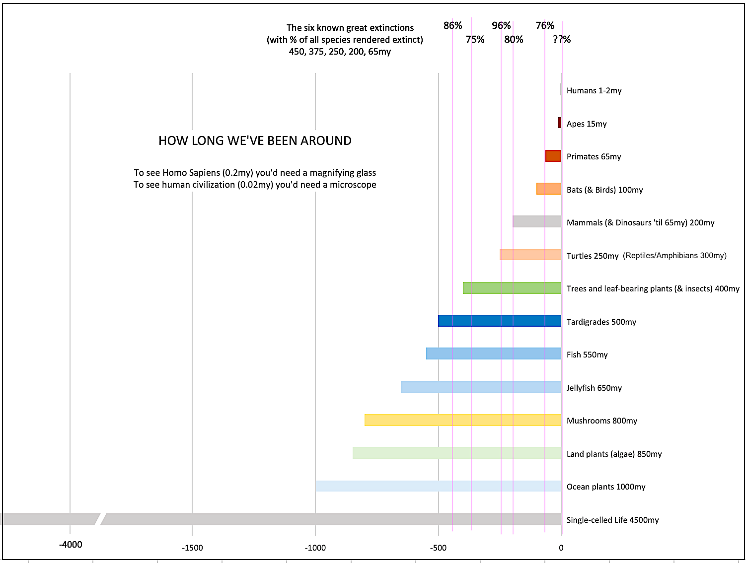
How Long We've Been Around (graphic)
If You Wanted to Sabotage the Elections
Collective Intelligence & Complexity
Ten Things I Wish I'd Learned Earlier
The Problem With Systems
Against Hope (Video)
The Admission of Necessary Ignorance
Several Short Sentences About Jellyfish
Loren Eiseley, in Verse
A Synopsis of 'Finding the Sweet Spot'
Learning from Indigenous Cultures
The Gift Economy
The Job of the Media
The Wal-Mart Dilemma
The Illusion of the Separate Self, and Free Will:
No Free Will, No Freedom
The Other Side of 'No Me'
This Body Takes Me For a Walk
The Only One Who Really Knew Me
No Free Will — Fightin' Words
The Paradox of the Self
A Radical Non-Duality FAQ
What We Think We Know
Bark Bark Bark Bark Bark Bark Bark
Healing From Ourselves
The Entanglement Hypothesis
Nothing Needs to Happen
Nothing to Say About This
What I Wanted to Believe
A Continuous Reassemblage of Meaning
No Choice But to Misbehave
What's Apparently Happening
A Different Kind of Animal
Happy Now?
This Creature
Did Early Humans Have Selves?
Nothing On Offer Here
Even Simpler and More Hopeless Than That
Glimpses
How Our Bodies Sense the World
Fragments
What Happens in Vagus
We Have No Choice
Never Comfortable in the Skin of Self
Letting Go of the Story of Me
All There Is, Is This
A Theory of No Mind
Creative Works:
Mindful Wanderings (Reflections) (Archive)
A Prayer to No One
Frogs' Hollow (Short Story)
We Do What We Do (Poem)
Negative Assertions (Poem)
Reminder (Short Story)
A Canadian Sorry (Satire)
Under No Illusions (Short Story)
The Ever-Stranger (Poem)
The Fortune Teller (Short Story)
Non-Duality Dude (Play)
Your Self: An Owner's Manual (Satire)
All the Things I Thought I Knew (Short Story)
On the Shoulders of Giants (Short Story)
Improv (Poem)
Calling the Cage Freedom (Short Story)
Rune (Poem)
Only This (Poem)
The Other Extinction (Short Story)
Invisible (Poem)
Disruption (Short Story)
A Thought-Less Experiment (Poem)
Speaking Grosbeak (Short Story)
The Only Way There (Short Story)
The Wild Man (Short Story)
Flywheel (Short Story)
The Opposite of Presence (Satire)
How to Make Love Last (Poem)
The Horses' Bodies (Poem)
Enough (Lament)
Distracted (Short Story)
Worse, Still (Poem)
Conjurer (Satire)
A Conversation (Short Story)
Farewell to Albion (Poem)
My Other Sites


First, thank you, Dave, for doing the work you do. You make a huge difference.I don’t think we should try to grab peoples’ attention away from what they find important. I see any attempt to grab the attention of others as being control-related. In other words, I don’t think anything good ever comes from trying to control other people. People should do what brings them the most joy in every single moment. Other people should NOT pay any attention at all to what I think is important. They should pay attention to what THEY think is important. The Universe is orchestrating this great turning. If the violin thought that it should convince the oboe to shut up and listen to the strings, what would we have? A mess! 8-) I trust that the Universe knows what it is doing. My job is to pay attention to my own path.
That said, I think that for those who are naturally drawn to a particular topic deserve to have that information presented in as simple and clear a manner as possible. That’s where it is good to know which visual elements work best. In the case of the wiki, I never paid any attention to the wiki at all. I barely knew what they were. THEN I discovered a trick in Google where you can put “define:” at the front of a query and add any word that you want defined for you. Google then searches the Web for definitions and a lot of them are in wikis. This is the most useful tool for a writer/editor that I have ever in my entire life found. I LOVE IT. The Google tool brings the wiki to my attention at EXACTLY the time when I need the information and in a format that is simple to scan and easy to expand. This is technology!
Dialogue mapping and dynamic facilitation are two great tools, and not coincidentally they both involve charting group conversations on paper or computer projection screens.
The attempts of ‘global warming’ modelers to capture the entire biosphere would “necessarily be incomplete and misleading, a dangerous oversimplification that would inevitably lead to ineffective or even dysfunctional decisions and actions.”So why do you support the idea of man-made global warming when it uses the very tactics you condemn in this essay to garner support among the ill-informed?Basis:Hockey Stick Hokum – Wall Street Journal – July 2006http://www.climatescience.org.nz/assets/2006719215530.HockeyStickHokum.pdf“Fake But Accurate” Science?, American Thinker, Aug 2006http://www.americanthinker.com/articles.php?article_id=5770Recommendation:Let’s get the ‘climate change’ data used by the gloom and doom crowd that results in higher energy prices placed on the Net and let’s all take a look at it. The algorithms used to compute the results that Al Gore touts are fraudulent and in error (the “Enron of climate science”). This was discovered three years ago. Bottom line: man-made ‘global warming’ is a crock and we are being sold a complete bill of goods not supported by the data.